This screen is for building your survey as a set of response and control elements within pages. Most of the operation occurs in the main frame where elements are added to the survey pages, survey content such as question text entered and the elements customised.
General Operation
Formatting – Where textual content content may be formatted, a formatting menu at the top of the screen allows rich styling and optionally to edit the content in HTML code view – allowing fine grained styling and the inclusion of Javascript Code for front end interactivity or Network API integration.
Previewing work in progress – As the survey is developed, the preview button will provide a popup showing you what the survey looks like to a respondent, with some additional preview navigation allowing you to move around the survey without using the next button.
Survey Options Button– Here you may customise the survey elements such as the question and button labels and title. You will also be able to randomise groups of pages.
Survey Pages
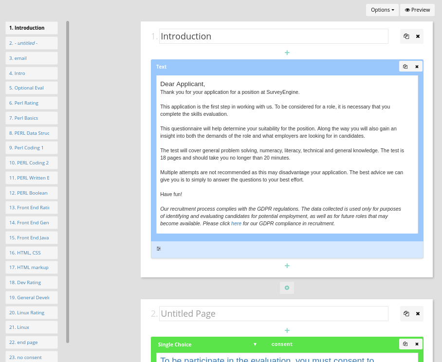
The editor is designed around survey pages. The survey will be displayed page by page to a respondent who enters responses and clicks on a next button to move through the survey.
On the left hand side of the screen is a list of all the pages in the survey. Clicking on a page will cause the main editor content to scroll to that page. Pages may be added or inserted either from the left hand side page list or from within the main editor frame. Pages may be duplicated or deleted by clicking the relevant icons on the top right of the page.
There is no effective limit to the number of elements per page and a survey could possible be created with all the elements on one page. This should be discouraged in a long or complex survey especially where screening and calculations are performed that affect the content later in a survey. A good guide is to group related content by pages for ease of both management and comprehension by respondents.
Survey Elements
All elements can be moved to a different place by clicking and dragging. Each element may be deleted of duplicated by clicking the relevant icons in the top right of the element.
A minimal approach to survey elements is used, with incremental complexity being added through customisation as required. Items can be added to pages by hovering over the position in the page you wish to add the element. The following elements may be added anywhere.
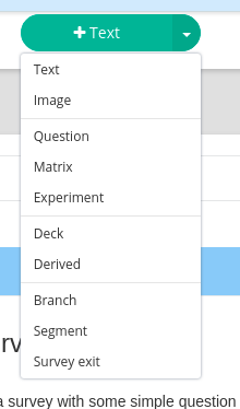
- Text and Images rich formatted text and images
- Questions single, multiple choice and open questions
- Matrix grid layout questions – single choice per row, multiple choice per row and text
- Experiments Insertion of experiment scenarios designed within the experiments secions
- Deck a random without replacement number generator across all responednts
- Derived for generating on the fly calculations
- Branch for changing the flow of the survey
- Segment assignment of a respondent to a segment for quota control
- Survey Exit for marking the respondent as complete or screened out and redirecting them out accordingly
Common Options
The following options are common to (mostly) all elements.
Display Conditions
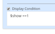
The display (or activation) of all elements can be controlled by a programmatic display condition. For example a display condition may be set to a text element such that it is only shown to respondents who select ‘Female’ in a prior question, or that respondents who don’t consent to participate are branched to a screen out page. This is available for every element.
Optional Completion
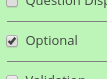
All elements requiring a response are by default set to mandatory, meaning that the respondent will not be able to proceed unless the provide input. This can be set to optional on an element by element basis.
Validation
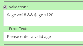
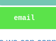
Each response elements can also have a custom validation and message set. For example a field requiring an email can have a custom validation that checks the entry has a ‘@’ symbol by entering the appropriate perl code in the custom validation box.
See validation recipies on common ways to validate use input.
Variable Piping
Variables entered (or calculated) anywhere in the survey may be piped back to the respondent from anywhere in the survey by adding the custom css ‘expression’ class to an html tag. Anything within an expression class will be automatically evaluated and the expression (and the tag) replaced with the result of the evaluation.
In a simple case. If the variable $name holds the person’s entered name, say ‘John’. Then later on in the survey, the following html.
Thank you <span class='expression'>$name</span>.
will be rendered as:
Thank you John.
Note – this must be entered in the codeview ‘</>’ in most elements – so that it is valid html
Data Labels
Elements that create data have data labels. Data collected is stored and accessed later by their assigned data label. Data labels must be a mix of letters, underscores and numbers and must start with a letter.
Randomise
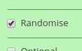
Selecting this will randomise the order of levels for multiple choice, single choice questions and matrix questions.
The Question Element
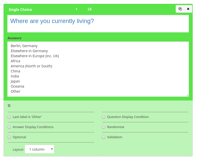
(insert screenshot)
The common element for eliciting a response that can we explained as a single question. The element can be customised as a Single closed choice, a multiple choice or open question by selection from the dropdown menu.
- Dimensions For open questions, the size of the text field can be specified in rows and columns
- Last Label ‘None’ For Multiple choice, adding this option will make the final level unselect any other options that have been chosen.
- Last Label ‘Other’ This will add a text box to the final level allowing the user to enter an open field.
- Layout 1 to 5 column layout, rating scale or a dropdown can be selected as the preferred layout for the question.
- .. all other options are generic for all element and described above
The Matrix Questions
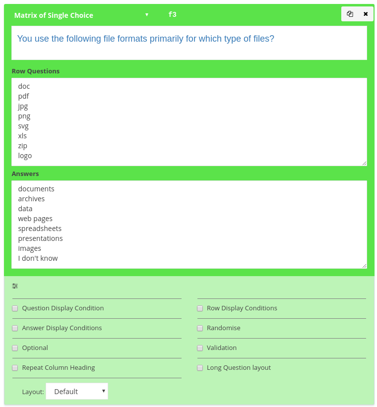
This question type groups questions that have the same number set of answers. For example, “For each of the following brands, rate them from 1 to 5.
Matrix questions may be Matrix of single choices, (i.e. select one option on each row), Matrix of Multiple choice (i.e. select any number of options on each row), or Matrix of Text (a grid layout of text questions).
- Answer Display Conditions Like the question display conditions, conditional display of each of the rows can be programatically controlled. This is useful in the case where the use selects a set of (say) products they own on one page. When they are then asked to rate them in a matrix question, applying an answer display condition allows only the respondents products to be displayed. =>see the tutorial on answer conditions
- Long Question Layout This option allows the row questions to float above the options and is useful when a large amount of text is used for each of the row questions
- Repeat Column HeadingThis option repeats the column above each set of row selectors. This is useful when a the matrix has a lot of rows and ensures the description of the option being selected is always in view
- Layout – (Matrix of Single only) For single row choice matrix questions, layout can be a series of dropdowns, making better use of the space or a drag and drop layout. The drag and drop layout is very for useful ranking items as it is more intuitive for respondents and not possible to make mistakes as it is with a ranking a matrix of questions. Note however, with this layout, the number of rows must be the same as the number of answers as the rank order must be the same as the number of items being ranked.
Experiments
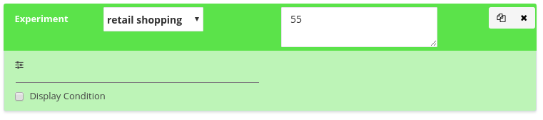
This element allows insertion of a scenario from one of the experiments specified in the Experiments screen by selection from the dropdown box.
The scenario may be left blank in which case a random-without-replacement allocation will be made from the experiment design. This will ensure an even allocation of scenarios across respondents. With allocations from incomplete respondents are automatically recycled as they are with decks.
Alternatively the scenario allocation may be ‘hard coded’ by entering the design row – or a perl expression which is useful for block allocation.
Deck
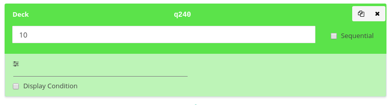
This element generates a random-without-replacement number between 1 and N, the number entered. Similar to shuffling and dealing a deck of cards of size N. This is used frequently in controlled trials where a desirable property is random but even allocations to respondents. Decks allocations ensure that after N respondents, each number between 1 and N has been allocated precisely once. Deck allocations for respondents who fail to complete the survey are recycled and reused for new respondents, ensuring that over a large trial, deck allocations are relatively even depending on dropout rates and number of respondents completing in parallel.
An option to make the deck ‘sequential’ provides the same functionality as above but allocates numbers 1,2,3.. to N in order. This is sometimes for testing deck allocation or for allocating to a priority list.
Derived Values
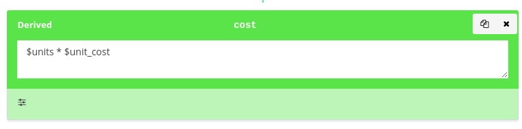
Allows creation of ‘on the fly’ variables within the survey. This is useful in many areas in complex surveys. The expression is evaluated in the PERL language in a safe compartment isolated from the system. The expression has access to all the respondent’s entered data as local variables and most PERL function with the exception of system and network functions.
As an example, if the respondent enter their email address in an open question with the data label email then this data is available as the PERL variable $email.
There are many uses for this element, including
- Calculation of the blocking offsets in blocked experiments
- Performing database lookups of based on user input – e.g. postcode matching
- Generating text labels from input data to display back to respondents
- preparing complex screening criteria to simpler variables for later branching and auditing
- Performing volumetric calculations e.g. total quantities from user provided number and frequencies
- … and many more
=>see more PERL guide
Branch
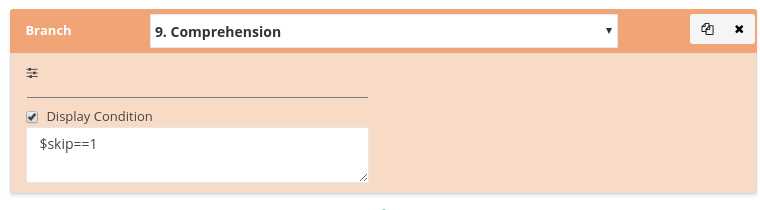
An unconditional branch to a different page in the survey. Typically a display condition is attached to the branch, making the branch conditional on the boolean (true or false) evaluation of the function. The most common use of the Branch element is to send ineligible respondents to a final screen out page if they fail to meet some criteria.
Branches can also be used to jump over pages not relevant to a respondent, e.g. jumping over a followup open question to unselected brand. As multiple branches can become unwieldy for a researcher to manage and endless loops are possible, using display conditions is a preferred alternative scheme.
Segment
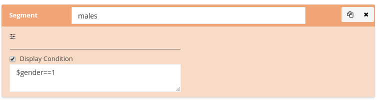
Allows the assignment of a respondent to one or more quota segment. As quota criteria are often not known until a respondent provides enough information at some point in the survey, segments are included within the survey flow and are assigned as the segment allocation criteria is discovered.
On assignment to a segment, the current quotas are checked and if the respondent would cause the quota to be exceeded, they are automatically screened out.
The normal operation of the segment element is to apply a condition to the assigment.
Survey Exit
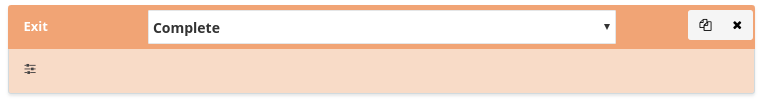
This element forces the completion of the survey. Respondents may be marked as ‘Screened Out’ or ‘Complete’.
While both mark the end of the survey, only the ‘complete’ exit status is used to determineoverall survey completions and whether quotas have been reached.
Where the respondent is sent after reaching a survey exit is determined by the invitation stream they were sourced from and their exit status.